
B R A N D I N G
Startup ID for a co-working space in Nottingham

Client Brief
Founded in Nottingham by two freelance graphic designers, a new brand ID was commissioned for the launch of a co-working space that places an emphasis on cooperation and community.
Objective
Develop a name with a strong rationale, a clear visual direction, appropriate tone, and full brand rollout to help launch a co-working product with a personality big enough to be franchised in cities right across the UK.
Action
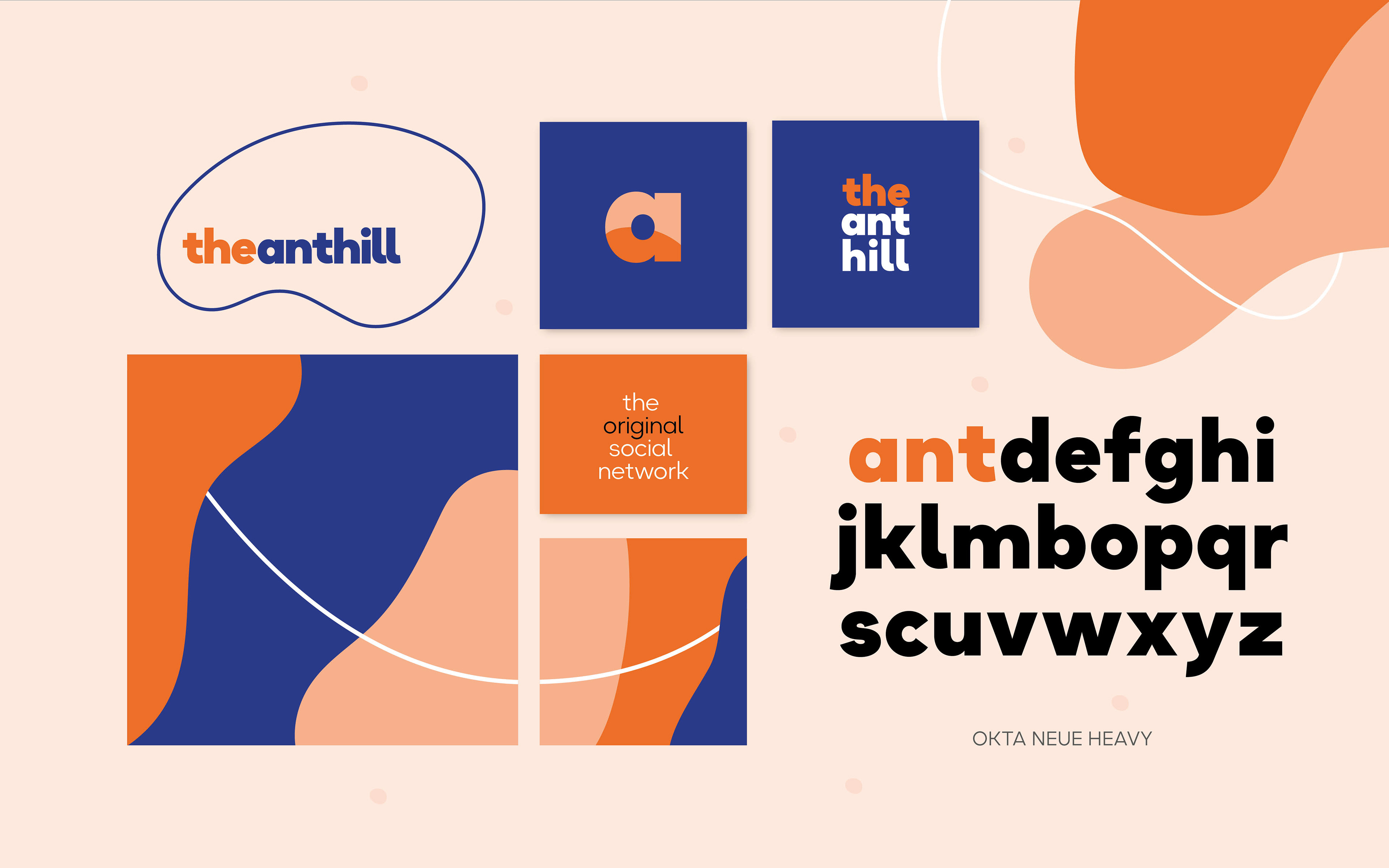
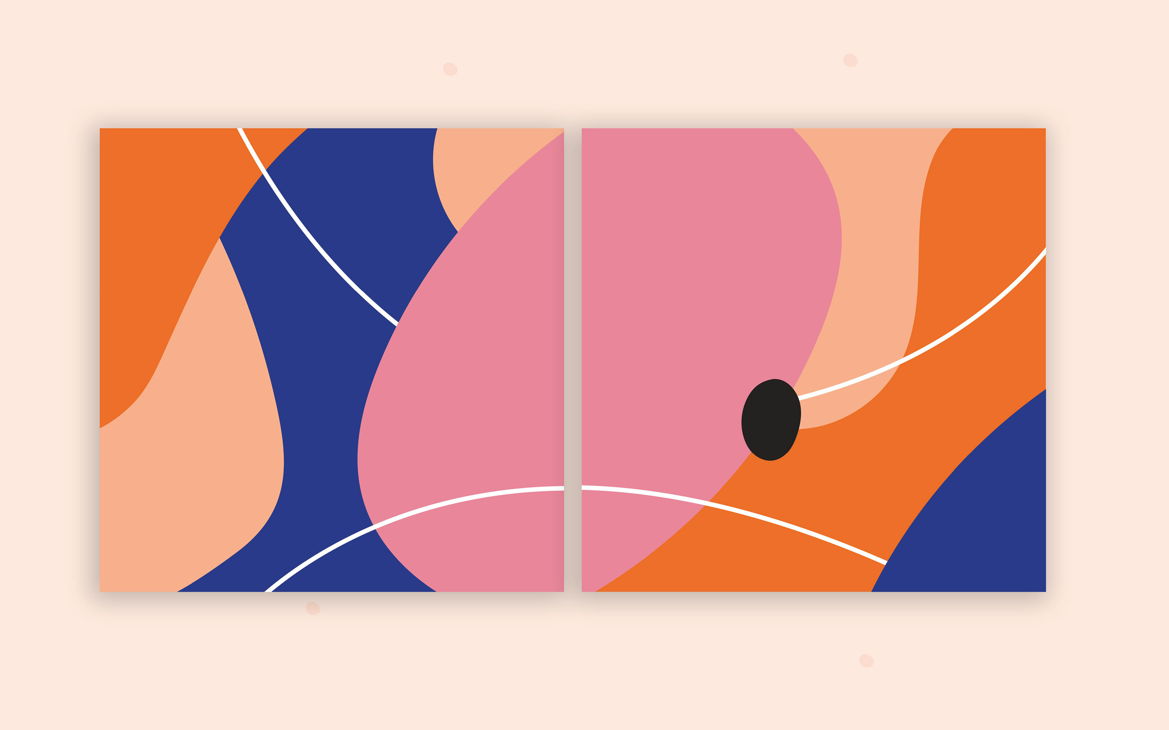
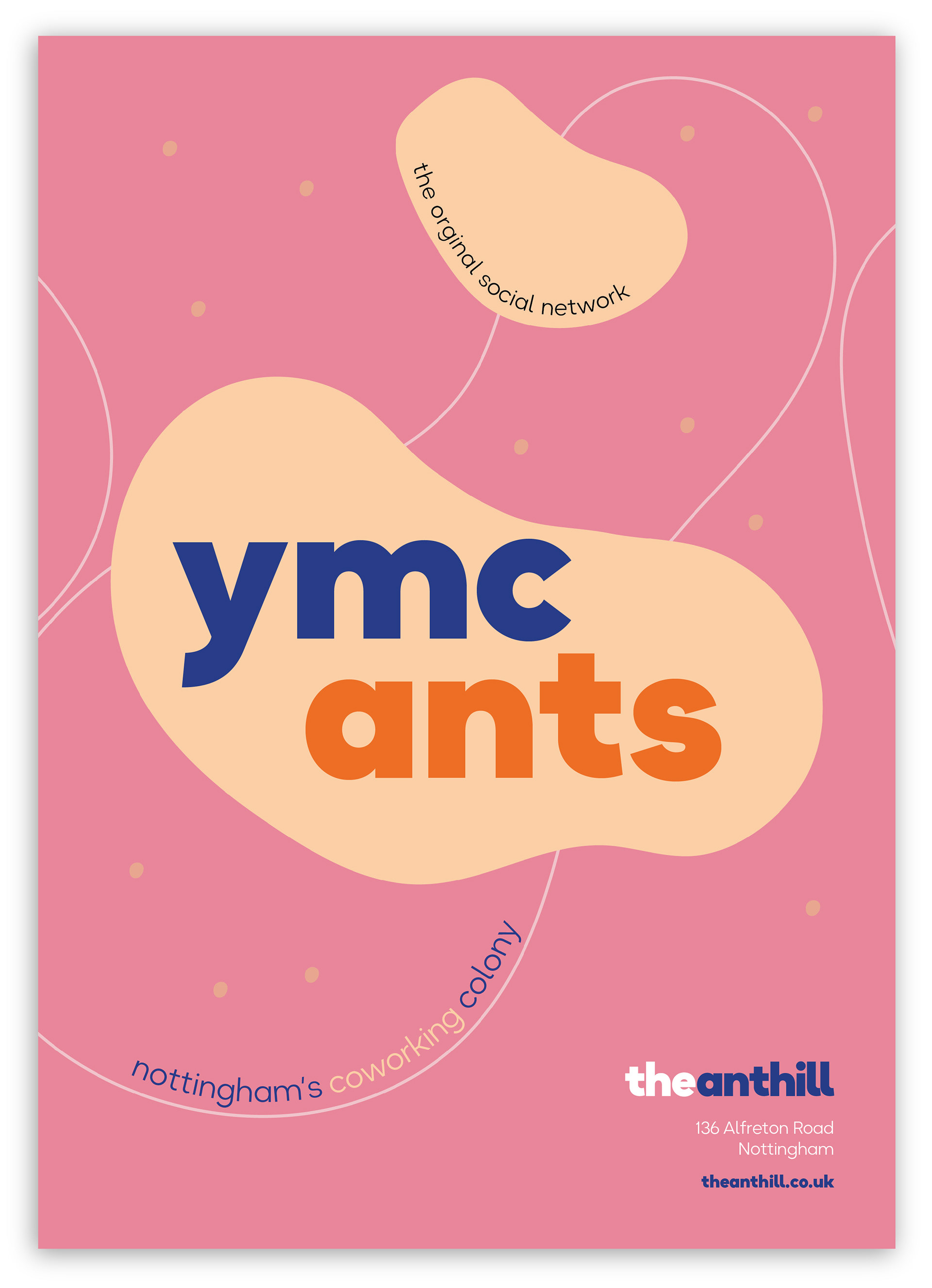
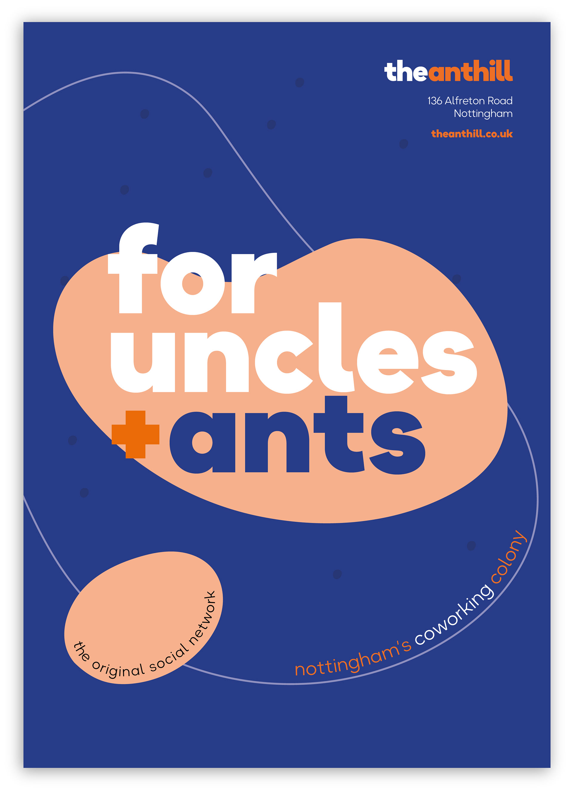
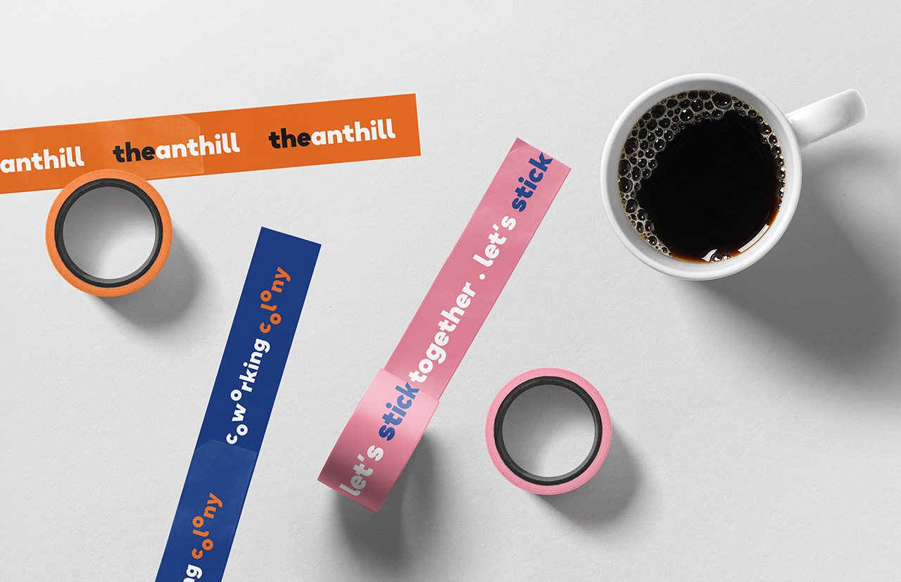
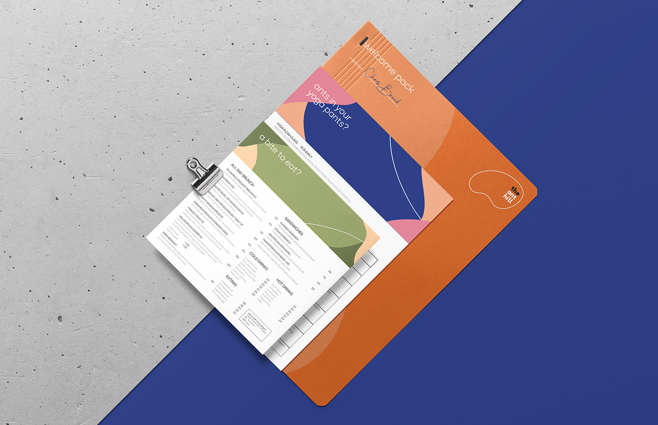
Beginning with deep competitor and user research, brand values of 'Optimism, Community and Irreverence' were chosen. Established a tone that is both lighthearted and cheeky, appealing to creative instincts. Selected a colour palette to stand out on advertising and branding collateral. Developed a flexible kit of graphical elements that form an abstraction of the inner workings of an ant hill cooperative.
Result
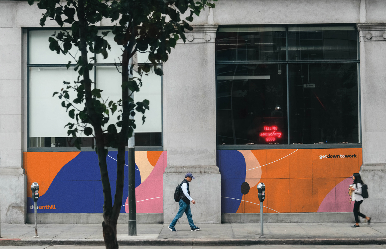
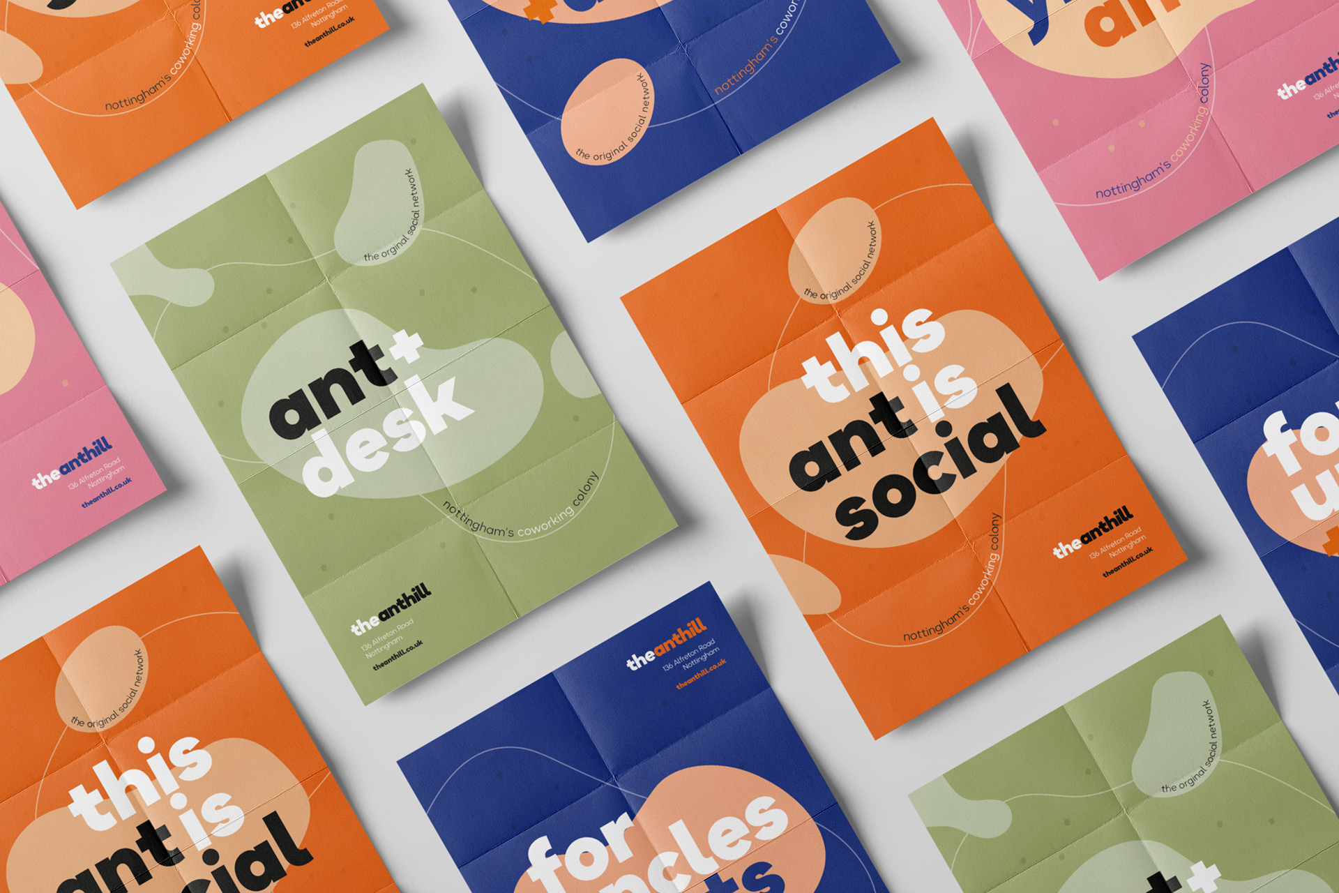
A punchy and recognisable identity, ready to be rolled out across multiple media. Clean typography and tongue in cheek slogans are used for the advertising, chosen to elicit a sense of positivity in the user and position the space as a creative alternative to the more corporate co-working spaces in Nottingham.