
B R A N D I N G + P A C K A G I N G
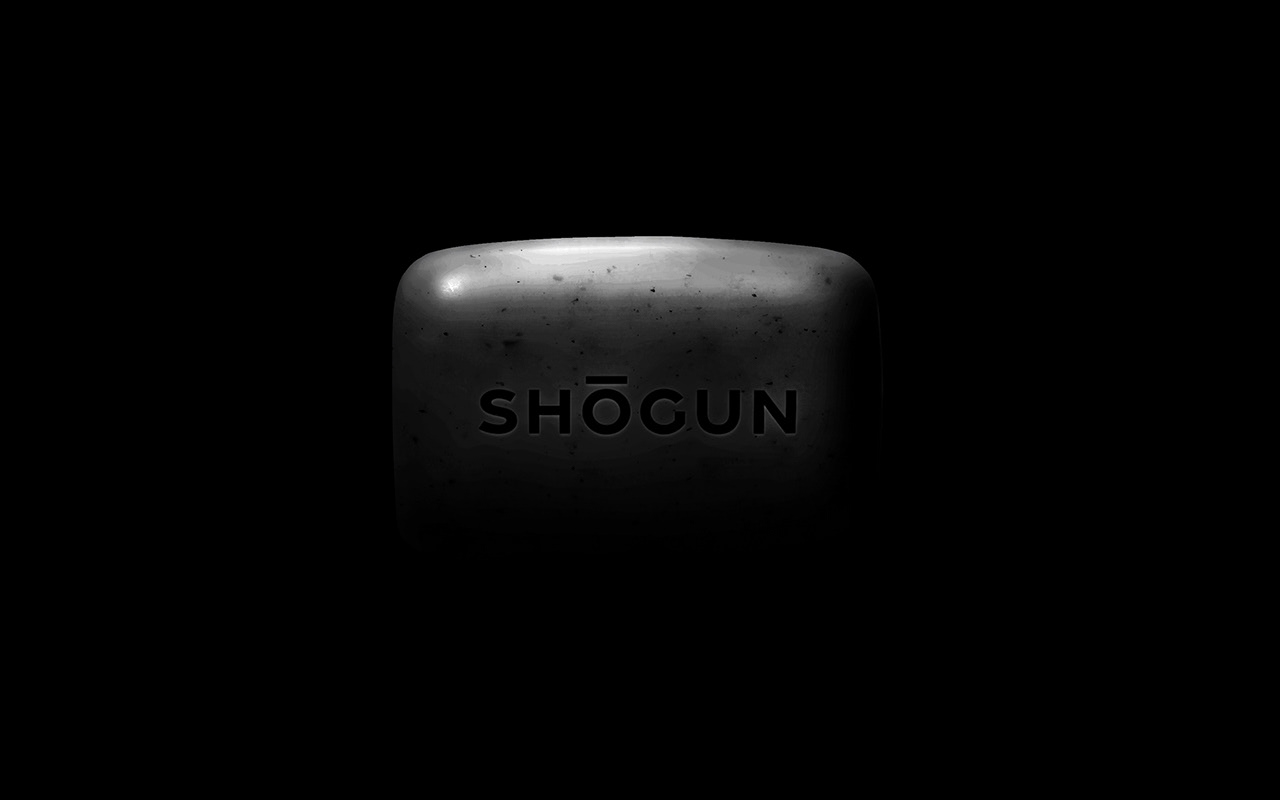
Japanese Charcoal Soap

Client Brief
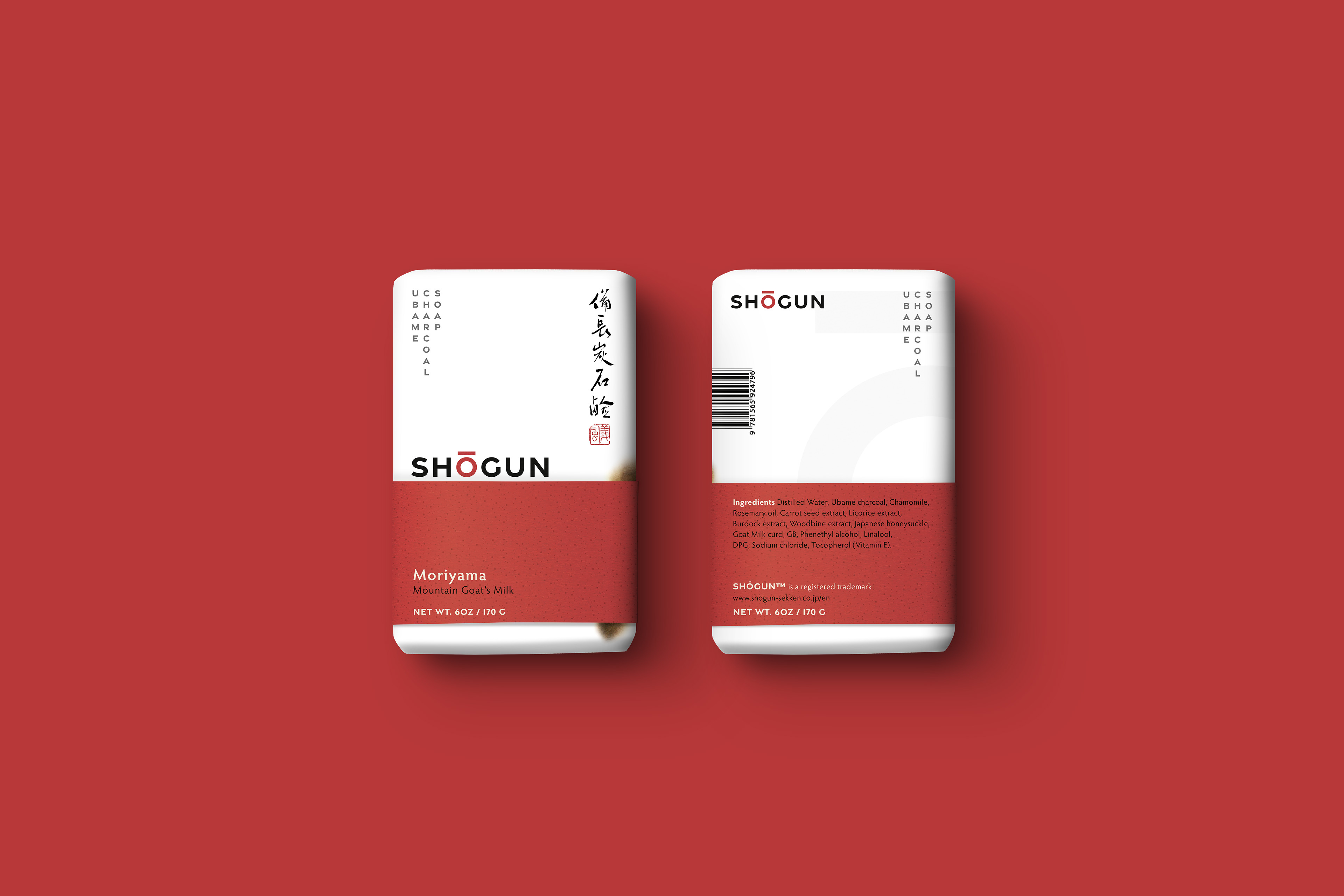
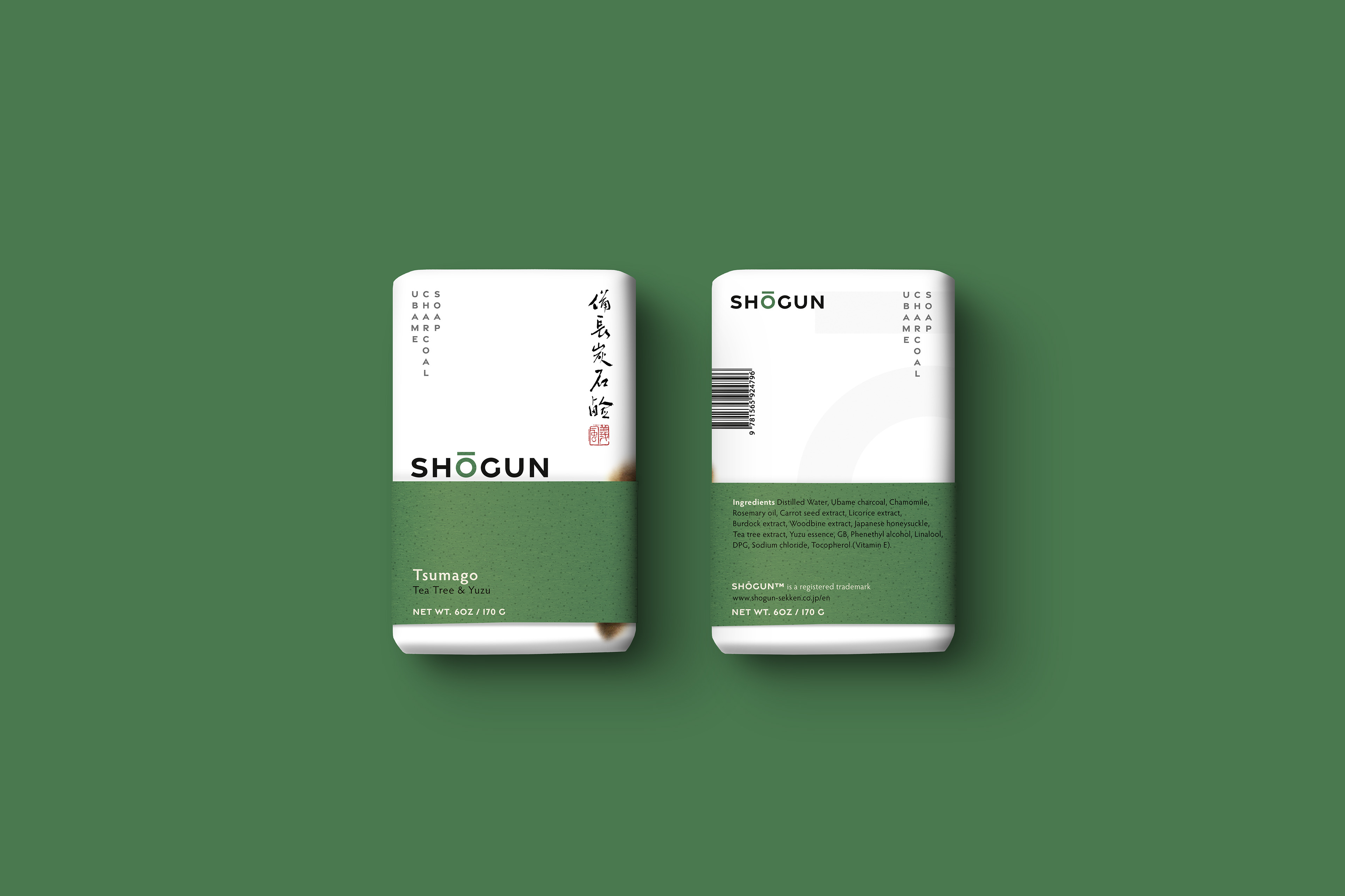
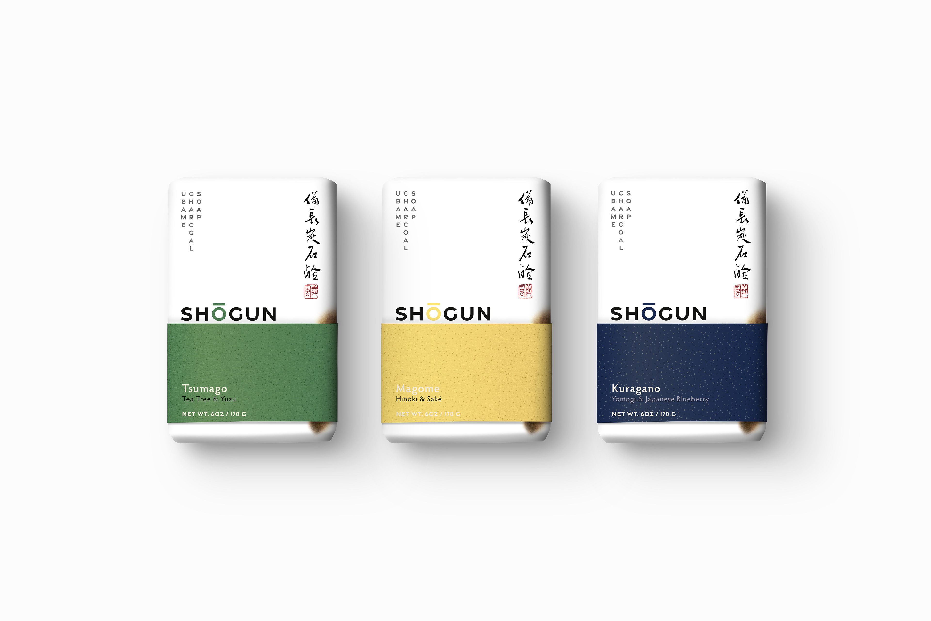
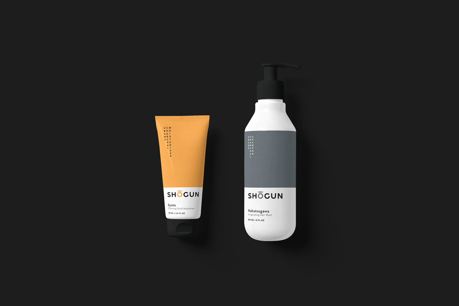
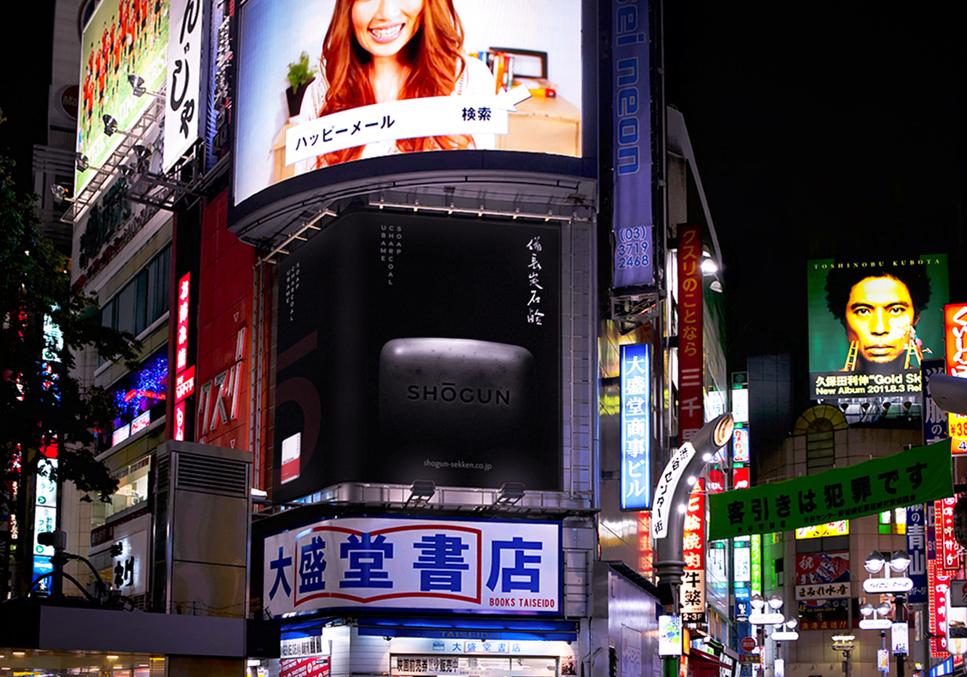
Brand development and visual identity for a luxury Japanese charcoal soap, targeting men in mid-life who are new to investing in their appearance.
Objective
Devise a compelling back story and name, highlighting the artisanal qualities of Ubame Charcoal soap, that supports a range of products to be sold in high end stores around the world.
Action
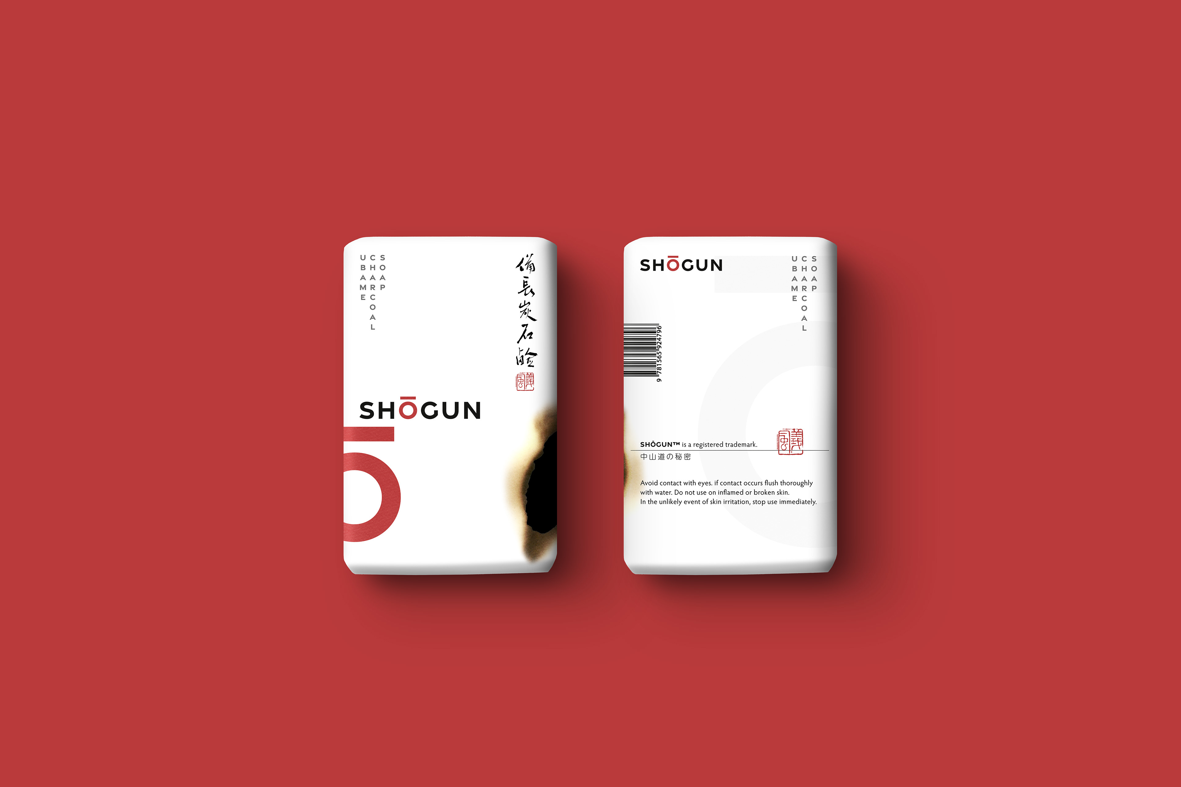
Researched imagery of Samurai from Edo period Japan for inspiration, choosing the name Shogun for its meaning as 'Leader of the Samurai', and thus a leader of men. Explored use of graphical elements to support a masculine appearance and reference the charcoal ingredient, seen in the packaging's burn mark. Commissioned bespoke calligraphy to ground the product in its historical and cultural backstory.
Result
A brand identity influenced by Japanese design principles of precision, care, subtlety and simplicity. Shogun's design flexibility can be carried through to additional products that live comfortably in a competitive market place.